How effective is the combination of your main product and ancillary
texts?
The combination of our main product, review and poster have all been effective in terms of what type of product we have attempted to create. We have used many techniques which are used in the in real media products and this research is presented in different forms on our blog. We researched into a variety of real media products from posters, short films and also film reviews which helped us all to create products which were of professional quality. Our target audience was 18-35 both male and females who enjoy scary films. We believed this to be the most appropriate age audience group based on the fact that a lot of scary films are certificated 18 and above. Using this age group allows us to target the majority of people who are likely to watch this type of film.
Our poster was designed with the intention to suggest our genre - which is psychological thriller. These types of films are iconic for dark colours, lighting and mysterious characters. The combination of these three products will help to promote our film and give the audience a good idea about what it may be like for someone to have a psychological disorder. The Faceless Man challenges the theme of mental disorder and gives the audience an insight to what it might be like to have schizophrenia. Although it is never mentioned throughout the short film about exactly what type of illness Alex had it suggested that he may be imagining things which are shown through flashbacks, character expression and body language. We attempted to make the film seem almost paranormal at times, however it was never suggested that The Faceless Man was actually anything supernatural.
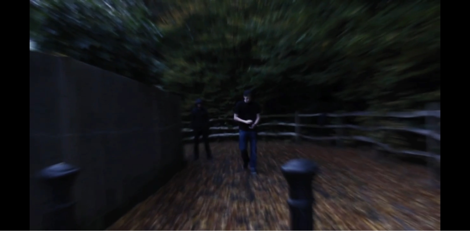
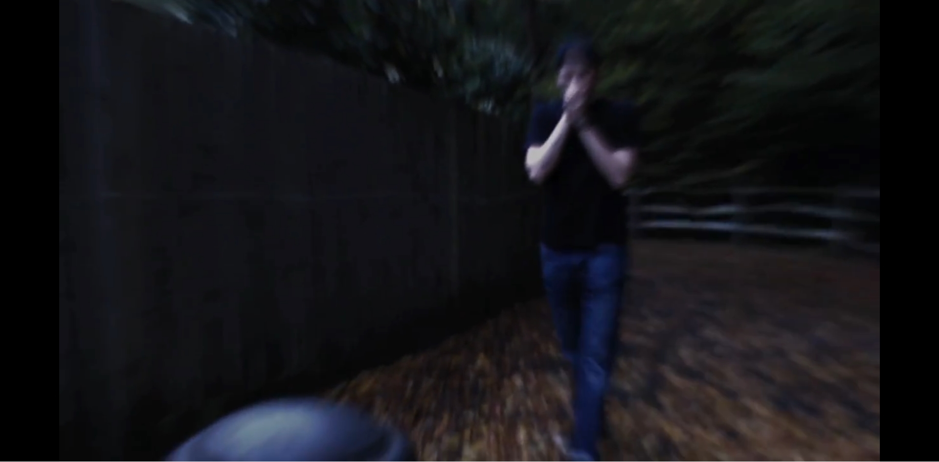
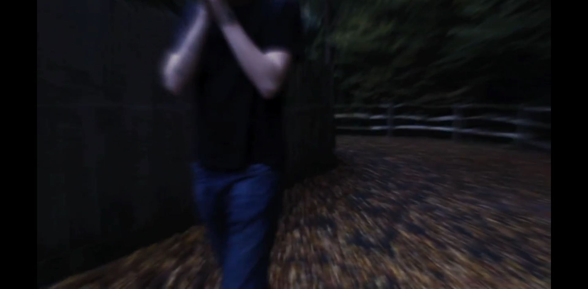
The main product itself (the film) is a psychological thriller. Something which helped to suggest genre throughout our main product was lighting. Lighting played a vital part in showing the more dark side to our film which also helped to create a good atmosphere for the audience. It was important to us that we created a realistic atmosphere which would make the audience feel scared at times which is something that is common in a psychological thriller. The typical conventions of a psychological thriller are shown throughout our film through post production, for example jump cutting was used to create a high level of tension and to show The Faceless Man up close. The reason behind us keeping his face covered up throughout the duration of our film was also to create a high level of suspense for the audience, allowing them to be guessing of who he is - this is a common technique used to create enigma in these types of films.
We were given the feedback that our film was effective in the way it delivered tension and atmosphere but someone mentioned the screaming added in at times were even comical, which is obviously something we did not want. However we understand how this may have been comical due to perhaps over using certain sounds or even using them in the wrong place. The sound was something which also played a vital role in making our film atmospheric, which is commonly seen throughout psychological thrillers. I believe sound is so useful in films like these because sound is something which can not be seen which allows our brains to make up what that sound might look like or even imagine who is making the sound. Our poster was carefully designed with a clear idea in mind. We knew we wanted something which would be striking to the eye but simplistic in design, which I believe we managed to achieve. Our poster is effective in the way that it stands out due to the layout of the poster and the colours used, although we only used three main colours I still believe this is effective in making it stand out amongst other posters alike.
The review is accurate in terms of the comparison between our product and other films which share similar ideas and a similar narrative. It follows a similar structure to that of a Little White Lies review. The style of writing is professional and gives the reader a good idea about what is to be expected of the film and has an overall accurate description of the short film. The layout of the review is professional-looking as we created a template on Adobe InDesign following the same layout as the well known magazine 'Little White Lies'. Little White Lies magazine uses a lot of mature media language which suits the audience they are aiming at. We have attempted to create the same level of sophistication throughout our review and have attempted to create their level of uniformity to their simple yet effective layout which is aimed at their demographic.
3.) What have you learned from your audience feedback?
Audience feedback is essential when creating professional quality products. Audience feedback has helped us to make decisions about our film which would benefit us in a number of different ways. Although we lacked a certain amount of audience feedback there is a certain amount which were useful. We decided that our audience would be between the ages of 18-35, which I believe is a good age range with plenty of variety. Thriller films and psychological thriller films are the most popular with this age range and this is why we decided to aim our shortfilm at this demographic.
As a group we carried out a number of questions in order to gain some valuable feedback on our film, research and planning ideas. As a result we only managed to get feedback on a small number of people however it was enough to give us an idea about what we would have to make adjustments to in general. This feedback was enough to give us something to work from and improve our product so that it would be even more appropriate for our target audience. Jacob cleverly put these results into a series of pie chart (shown below). These help to explain our findings although they are not particularly specific it helped us to gain a good idea about what people thought in general about our film. The pie chart below directly shows how over 87% of people agreed that our story worked well and fitted with our theme of psychological thriller (which was very important to us). Whereas only 12% of people had certain issues with the narrative especially at the end as it was perhaps confusing at times for the audience.
With only 12% of people saying that our story 'maybe' works shows that overall it was clear about what was happening during the shortfilm and what relevance each character had to the plot. We established together as a group that the plot itself was a good idea but our overall execution lacked in certain areas, for example the narrative may not be clear in certain places causing 'confusion' which is what some of the people surveyed had used to describe our narrative at times. This was the only reason for them choosing 'maybe' instead of 'yes'. However we did not expect everyone to agree that our film worked well as there is always room for improvement although we were pleased to see that no one voted 'no' towards the answer.
The pie chart below was using the same group of people but this time the question asked whether or not someone would go to see this film in a cinema. We were slightly surprised to see that only just over 60% of our audience would go to see this film in cinema as this is only just over half. However these people stated that they did not like category of film anyway which we were not too bothered about as this was something which was out of our control. However we still had a large number of people who voted maybe instead of directly 'yes'. We were disappointed to see so many people would were sceptical about whether they would go to see it in cinema or not, but afterwards we remembered that it was only a short film and not a normal film so we thought perhaps people might have thought that it might not have been worth going to see a shortfilm.
However although we received slightly negative feedback about whether someone would go to see it in a cinema we found out that people found the screaming and some of the backing track in the short film more comical than funny. We understand from their point a view how this may have seemed but we decided to include this in as it helped us to suggest genre and keep within our psychological thriller theme.
Another pie chart below shows how many people agreed that our film was a psychological thriller or if they did not, what genre they thought it might come under. For example number of people said that our film was more horror based. I personally disagree with this as there are no iconic horror conventions used in our sequence. We attempted to carefully select conventions of a typical thriller / psychological thriller which would help to establish our theme. No one thought our film was anything other than a psychological thriller or a horror which was good to hear, even the people who said our screaming sound was comical said that our film was within these sub genres. We could understand why people thought it may just be a typical thriller film as we aimed to create out film so that it would be open to interpretation, for example whether or not The Faceless Man is supernatural is completely down to the audience. This is something which would make a typical thriller film into a psychological thriller.
Unfortunately even we knew that this would not be true to the storyboard as we had a lot of last minute planning and had to come up with a script due to a lack of organisation which let us down. We attempted to make the script as close to the storyboard in the short time we had however time management and communication let us down.
We received a few other types of audience feedback such as comments directly onto our blog which were similar comments made whilst we carried out these questionnaires with similar group members within our class. These pie charts below are also other pieces of audience feedback which helped us to improve certain aspects of our film, poster and even review.
3. What have you learned from your audience feedback
Audience feedback is very important for improvements and to understand what your target audience really wants, I am lucky enough to have a large family so during the christmas period I asked for their honest opinions on the faceless man. To do this without confusion I wrote a survey with three questions to answer after everyone watched the film I gave them a sheet with these questions asking them to tick which answer suited them the most.
Our target audience was 18-36 years olds, therefore I only asked those in the relevant age bracket concluding in 25 people answering my survey across the Christmas period.
I told my family and friends that honesty is key in this survey so there could be no bias thoughts or feelings attached. As you can see above is the results of the survey.
Question 1 was a simple question just asking if they enjoyed the film and the results were mainly positive with 6/10 being the most common result appearing on the survey, I believe this is a good result if you take into consideration the zero budget and short time period to make this film but it does also show that there is room for improvement which leads nicely to question 2.
Question 2 was a question on how to improve our short film with seven available options to pick. As the survey portrays the confusing ending option was the most ticked option on the survey with 18 out of 25 people agreeing with a confusing ending 6 people saying better acting and 1 person wanting an improved soundtrack.
I'll start with the sound improvements, I asked why they wanted to improve the soundtrack and they said it was too loud and hard to hear people talk, I explained it was meant to be loud as it would drown out the dialogue making it seem only Alex really remembers the Faceless Man and the conversation was irrelevant but its a valid point none the less.
People who said improved acting is totally understandable and I was surprised more people didn't go for this option as no one who performed in the film were actors as it was a zero budget production we couldn't hire anyone. Therefore the six people who said acting needed improving are completely correct.
Eighteen people said it was a confusing ending and I can understand why to a certain extent. The film was always meant to create enigma therefore being interpreted in different ways but I can also see how this is confusing. The three main interpretations we thought we would have on the film is Psychiatrist being the faceless man and actually hunting Alex, The psychiatrist having a brother who is hunting Alex and he's in on it as well for an unknown reason or the real ending we wanted and hoped everyone would understand is that none of this is real and all in his head.
I spoke to a few of these people after and a lot of them understood it was to do with mental illness but felt it wasn't clear between the psychiatrist and the Faceless Mans connection.
This is something in the future I will definitely learn from and look to improve in the future as the ending to a film can be the most important part to the whole film.
Question 3 was simply asking if they would ever choose to watch it from looking at the Poster, This was the most positive question where 22 of the 25 people said from looking at the poster I made they would watch the film. This is good to reflect on the positives and tells me that the poster was something that was a huge success.
Then as a group we asked other groups if they would write what they thought of our film on the blog allowing us too take their feedback and further improve.
This is from another group in our class where they are listing positives and negatives, the positives show that we took time to think of filming location and that we spent a lot of time in the post production of editing too but here they talk about the title where they say the title sequence looks as if it was used to fill time. We did indeed make the title a bit longer just to fill time but we tried making it still seem watchable with the numbers counting down before the title appears on screen but yes in the future we should of planned everything more precisely so the audience don't have to sit through a long intro. They speak about how the ending is confusing but effective. I believe this is a positive as that was the idea of the film all along to confuse people into thinking multiple alternative possibilities for what the ending means.
This group like the others gave some positives and some negatives about the film. They start off by talking about the Soundtracks which they thought were excellent, which is nice to know as it took a very long time for me to find the appropriate soundtracks and then layer different ones over existing sound to emphasise a specific scary moment in a certain scene. Its good to know people understood this was about mental health and insanity and like the way we showed that with the editing and that they appreciated the storyline as that is a very important element.
Here they also spoke about how the dialogue in the first scene was unclear this was possibly because during production we realised our voice recorder wasn't working so we had to use the camera's mic to pick up sound. We know this isn't very good so in the future we will check the mic the day before and also bring multiple microphones if possible but under zero budget that can be quite difficult.
The scary laughter being funny is a point I was surprised by but none the less I have tried to find out why, I believe it could be interpreted as funny because it was a scream from garageband and not done first hand but we will next time watch over a scene excessively if we included a scream as laughing ruins the whole feel and eeriness of the film and thats the main aspect.
In this feedback the group tell us how they found it interesting throughout but like the other groups the dialogue contrasted with the sound was their biggest issue. How it was originally intended was to be like that on purpose as during the flash back Alex is so consumed by fear and can only think about the faceless man everything else becomes a blur hence also with the disorientated filters but because multiple groups have picked up on this we will not use that technique again.
The Last post from the last group was a positive one and spoke about how they liked the soundtrack and editing because of the tension it formed as well as the concept behind hiding the psychiatrists face which is a major concept of our film so I'm glad it paid off.
Overall My family Members and friends found the ending the part which needed the most improving and my classmates overall decided the dialogue most needed to improve.
I Believe my family chose the ending and my class mates didn't is because we are media students who are taught to dissect films so its easier for us to understand. The media students could tell we didn't use a microphone for our dialogue so made that one of our biggest negatives because they can tell the difference just like we can. Both points equally valid and further proves how important audience feedback really is.
1. In what ways does your media product use, develop or challenge forms and conventions of real media products?
Originally The faceless Man was to be a short film designed to develop and combine traditional forms and conventions of real media products. In the end we didn't use many of these conventions as we agreed the best way to create a good film in the short amount of time given to us was to construct it from a diverse range of other short films, therefore looking at the elements which already exist in other media products. The narrative of our short film is organised with a non-linear platform with certain elements of circular narrative, mostly driven through our diverse imagery. A good example of circular narrative is the blurred face of the Faceless Man through out the whole short film then concluded by the final shot where we see the faceless mans face revealing his true identity.
The Conventions of a film are key for success and we knew this well, therefore for genre we really tried hard to include an eery psychological thriller feel towards the film as well as include some scary post productive non-diegetic soundtracks and filters at the end to really emphasise this effect, but we didn't want to be stereotypical making the mise-en-scenes settings dark and fearful we believed the biggest fear of mental health is 'insanity during normality' with the concept that schizophrenia could happen anywhere anytime.
None the less we still decided to use darker lighting with disorientated and low key post production effects on the flashbacks to emphasise the fear for our target audience.
With our short story its hard to find time for character development therefore to try and tell the whole story we relied mainly on flashbacks and visual effects for people to understand the character and what he is dealing with. Frame Analysis
As a group we decided these were the most important frames during our short film as each frame has an individual role essential to the idea of the Faceless Man. The first frame is the title of our film and the title is important for the obvious reason that it tells you what the film is called but it also does more than that, straight away even without hearing sound the white font combined with the black background creates an eerie effect along with the slightly crumbling letters at the end is a convention of horror, furthermore linking with a fragment of someone's face straight away gives the audience an idea of the sort of film The Faceless Man will be. The second frame shows us the main character called Alex as he starts fidgeting whilst spinning the globe in front of him. For this specific scene we decided to use the technique of low depth of field as well as a focus-pull in order to pull the attention of our target audience towards the globe. We chose to use a focus pull in this scene to demonstrate the fidgeting that 'Alex' is doing. For Alex's costume we decided to use smart clothes complemented with a nice watch to show that Alex is a wealthy young man and not some stereotypical rough looking gentleman as we thought this would be good as it shows mental illness can happen to anyone including the rich. The room we chose to film this scene in was deliberately laid out to look like a psychiatrists home office with the big comfy chairs, wooden table and book shelves as the décor of the setting. Even the globe prop was designed to look like it would belong in a psychiatrists office. The third frame is showing us the faceless man during one of Alex's flash backs, the reason why this scene is so important is because it shows how Alex is seeing the faceless man. This frame and overall scene from the short film is demonstrating that the Faceless Man can be seen anywhere at any time even during the day and even with someone else. During this frame we used jump cuts to make the scene distorted as it shows fear and confusion. We also implemented filters with the whole flashback scene making it darker in lighting and almost blurry so people know its a flash back, we used the same technique throughout each flash back. During this scene we layered non-diegetic soundtrack over the scene drowning out a lot of the sound, its easy to understand the dialogue but the idea was to use the music to almost erase the dialogue in order to show that in Alex's flash back the faceless Man sighting is the only thing he really remembers. The Fourth frame is a subtle image of the Faceless Man. This same frame features in the short film multiple times at random points whilst talking to the psychiatrist. This shot uses the same filters as the flashbacks but has an added reddish filter. The same sound an eerie squeal happens every time the Faceless Mans face comes onto the screen, this can be interpreted in two ways that its added effect for the viewer or the character is hearing this in his own head due to his mental health, either interpretation makes sense but to create enigma the viewer can decide for themselves. The reddish filters and short duration doesn't indicate another flash back but insanity which is what the short films about. In this fifth frame You can see the protagonist Alex's hand on the arm of a leather chair. We decided to use this leather chair as a prop in our film as it suited the psychiatrists décor. This yet again is a demonstration of Alex's nervous and fidgety nature showing he is constantly on edge. The Background for this scene is the same as the second frame. The constant in the setting and costume shows the audience its the same day and they haven't moved from this spot. The sixth frame is from the second flash back. It features all the appropriate flash back techniques we maintained throughout our flash backs including the filters to make it distorted, dark lighting and layered non-diegetic sound to emphasise the fear but we also used a technique of using camera movement and timings for our actors to make it seem as if the Faceless Man disappears once Alex walks past. This technique along with the new crescendo non-diegetic soundtrack makes this flash back eery and one of my personal favourites to film and edit. This whole shot is trying to show that The Faceless man is all in Alex's head as he simply disappears once Alex turns around. The seventh Frame is another nice scene. The red filter and distorted effects shows its another demonstration of insanity except this time its of Alex himself. Before this scene we used some small second clips of the same frame throughout the sequence but they had natural filters and no non-diegetic music. We did this because we wanted to show constant insanity, that throughout every situation and everyday that short frame is how Alex feels in his head. The reason that didn't make the top nine frames is because the longer filtered variation of this frame (the one shown above)has a darker meaning. It still is a symbol of constant insanity but now it consists of not just filters but non-diegetic soundtracks and a possibly diegetic or non-diegetic scream. We wanted to reveal that the Faceless Man and Alex are the same person in the sense that its all in Alex's head; The end shot revealing the psychiatrist to be the Faceless Man is the conclusive finale of our short film but if you look into the comparison of this frame and the Faceless Man red filtered frame you will realise they are identical further explaining even the psychiatrist isn't real as he is the Faceless Man, therefore concluding in Alex talking to no one in reality showing he is well and truly insane. The Eighth Frame is a tracking shot from the third and final flashback this flashback consists of the same techniques used in the other flash backs with filters and non-diegetic sound but in this flash back its set at night and in his own bedroom. The fact its set at night makes it even more scary as night time is associated with fear and the thought of the unknown. During this shot we see the protagonist wake up about to open up his window.
The Ninth frame happens straight after the end of the eighth and features the last part of our film, in this scene we see the Faceless Mans actual face as a new crescendo of non-diegetic soundtrack plays over the original flash back soundtrack as it jump cuts closer towards the Faceless Man, it then cuts out of the flash back instantly to reveal that the Faceless Man is the Psychiatrist. This then causes people to think that the
psychiatrist has been hunting Alex all this time when in fact as I said in frame seven its not quite as it seems.
The Smiling Man Influences
The Smiling Man is a short film our group took inspiration off, we thought the sense of fear in normality (just walking down the street at night) is one of the aspects of this short film we really liked, I researched some of my own short films but they have no relevance to our actual film. It was when we all watched this last minute did we decide we wanted to go down this route.
The Smiling Man is about a man who dances towards a random teenage boy whilst constantly smiling its a basic yet excellently delivered short film which concludes with the smiling man catching up with the teenager coming face to face with him just like you see on the photo above.
The things we took from this short film was the use of just two actors we thought it was effective just having two actors on screen as it maid in feel as if the protagonist is well and truly alone as that in itself can generate fear on its own.
The second inspiration we got was the feeling of when the Smiling Man disappears as we thought the feeling of the un known is also very powerful and for a psychological short film like ours that can effect someone severely as the anticipation can drive someone insane (our character Alex is a good example of that.)
The third emotional influence we got from The Smiling Man was confusion. In the Smiling Man we are unaware to why the Smiling Man has chosen to chase this teenager and that's shown in our short film with our protagonist Alex being confused to why he is being 'hunted' by the Faceless Man, confusion is an emotion that can drive people mad and we thought with Alex's schizophrenic health condition this could increase the effect of his schizophrenia.
The Faceless Man LWL Review
For our review we copied the layout and the way Little White lies is written perfectly. We used Latinate Lexis in our review to make it sound more sophisticated and formal whilst also hoping that it reaches beyond our target audience of 18-36 as an older generation may read this and therefore entice more people to watch the short film. We all developed and produced this short film so it was difficult to write a review as someone watching it for the first time so we used this review as a good way to talk about what we thought was good about the film and what could be improved for example the insight into mental health was a good aspect of our film but the acting didn't justify it as none of us who made this film are actors so it wasn't easy to portray the characters in the ideal way we intended. We included techniques Little White Lies used in their review with comparisons to major films like Fight Club where brief millisecond frames of the faceless man pops up throughout the film just like in Fight Club. We also spoke about essential things outside of the actual films like our zero budget and time to make this film and how that has potentially damaged a great short movie.
Because we thought the flashbacks were key to our film we spoke a lot about how the narrative of the movie is used through the use of flashbacks and without these flash backs it would be a very confusing and boring film for the audience.
My Film Poster
This is my finalised film poster that I made for my film. The black and white theme of colours makes it seem more eerie and dark. The patchy background and hood of the Faceless Man gives a representation of the disorientated and almost crumbling reality of Alex's life.
I used Photoshop after I did a photo-shoot in order to create this poster. Its a simple poster with a unique title at the bottom left to make its stand out and with the patchy contrast of white to black background it shows a sense of good versus evil or in this case sanity versus insanity. The Faceless Man is slightly bigger than Alex to show that he is controlling is life and consumes Alex's identity, his face is rubbed out but looks distorted, this effect was to yet again show the direction in which this film was heading.
I had ideas off some other Posters that I looked at and the one that gave me the most inspiration was the short film The Pig Child, although it doesn't look anything like mine I took inspiration from the simplicity of it yet the pragmatic complex it implied was vast. Every detail on The Pig Child poster told almost the whole story in just one picture, even the Text font gave away the genre of the film which is why I copied it as we both had a thriller conventional film.
I liked the fact it had hardly any colour to it as dullness doesn't always mean excitement it can mean despair which for both The Pig Child and The Faceless Man wanted to imply.
In this film,
I am going to be talking about how the ancillary tasks (the film review and
also the film poster) worked effectively with the main task to create a strong
final product. This final product is essentially a complete marketing package
which could potentially be used to market, distribute, and profit off of the
short film that we have created.
The first of
the two secondary tasks that I’m going to be talking about is the film poster.
The audience that we were targeting with our short film is both males and
females between the ages of 18 and 35; thus, the target audience of our poster
is also the same. We primarily tried to target this audience through using
similar genre conventions in our poster as we did in the film. Though the
amount of these we could achieve was limited because of the limitations making
a poster faces as opposed to making a film.
One of the
elements of the poster that I focused on was the imagery. In the poster I
included a heavily distorted image of the antagonist in our film, I split the
image into it’s three different layers of colour (cyan, yellow, magenta), and
moved each layer of colour so they were all slightly off centre. I then
distorted this image further through smudging the edges. I think the distorted
effect that I created is very effective at conveying the genre conventions that
I wanted to when I started making the poster.
The font
that I used when creating the poster is very reminiscent of the font seen at
the start of Tarantino’s Pulp Fiction, I thought this was appropriate for the
poster simply because it seemed to fit well when I first used it. I used a
plain white colour for the font because it’s the most readable colour on the
black background that I was using.
Apart from
the array of colour that’s visible in the imagery of the poster, I chose to use
simple black and white colour throughout the poster. I chose to use simple colours because I wanted
to include a lot of information and content on the poster without making it
seem overcrowded. When I experimented with other colours in the poster it
looked much more cluttered and unorderly, so I changed it to look the way it
does now.
I also
included relevant awards for British Independent short films on the poster. I
made sure these awards were relevant because otherwise it would make little/no
sense in the context of our film.
I decided
that the location that the poster was set was unimportant for the effect that I
was trying to achieve, this is because I wanted to isolate the antagonist from
the backdrop. The place I really wanted to set the poster was inside the
protagonist’s mind, and this is best way that I could find to represent that.
All of these
elements that I have discussed are constructs of the psychological thriller
genre, and I used them as effectively as I could in order to make the poster
work well in combination with the main task. Beyond working well in combination
with the short film, I also wanted the poster to be attractive and to work well
when marketing the film and I feel as though I have achieved that. In marketing
our film, I would spread my poster through both social media sites such as
Facebook, Instagram, and Twitter. I would also try and inform people on its
existence through simple, old fashioned, word of mouth.
The Little
White Liars magazine film review that I’ve written for our film is primarily targeted
at the normal target demographic for LWL magazine, which is both males and
females between the ages of 26 and 35. Though not exactly the audience we were targeting
with our film, it’s very similar and this means that the review is more easily
effective at marketing the film towards our audience. The LWL magazine
communicates with its target audience through two different ways.
The first
way that LWL magazine communicates with its audience is through the language
and media language that’s used in it. It uses lots of media language and more
mature language which is appropriate for the audience that it’s targeting.
The layout
of the review also heavily contributes towards the demographic that it’s
targeting. All of the articles in the LWL magazine are set out in the same way,
with the same elements being in the exact same places. This creates a level of
conformity and professionalism that isn’t seen in other movie review magazines
and articles. One of the features of the layout that allows it to effectively
target the young adult demographic is the three-number based rating system,
giving each film that’s reviewed three scores. The first of these scores is the
anticipation, the second is the enjoyment, and the third is the rating of the
film in retrospect. This system allows the film review to be summarised at a
very quick glance, allowing people to understand the review at its core no
matter how busy they are, as a working young adult or film student.
The magazine
uses very professional fonts such as Algerian for the main body of the text,
and Century Gothic for specific titles. All of the fonts used in the magazine
are sans-serif to maintain simplicity throughout all of the articles.
1. In what ways does your media product use, develop or challenge forms and conventions of real media products?
Our short film does a lot to develop and combine traditional forms and conventions of real media products. We didn't, however, focus on challenging these conventions since we decided that the best way to move forward and create a good film in a short amount of time was to create a bricolage of elements which already exist in other media products. The narrative of our film is organised in a non-linear manner with elements of circular narrative, mostly driven through imagery. An example of where we have used circular narrative is where the antagonist/psychiatrist's face is shown in a distorted manner throughout different points in the sequence. A closeup of this same character's face has been used as the final scene in the sequence.
In our sequence, we have used genre conventions which are typically seen in psychological thrillers and horrors. An example of this is the dark lighting that we used in our sequence; In our research, we noticed that other films in the psychological thriller/horror genre dark lighting and heavy shadows were consistently used. For this reason, we decided to introduce this element into our short film and found it to be effective in creating the atmosphere that we set out to achieve. Another genre convention that we used in order to help create the correct atmosphere for our film is the use of flashbacks, we included three different flashbacks in our film to try and create a better narrative that tells our story more effectively.
9 Frame Analysis:
Each frame above has importance in our film on both an individual level and when looked at as a complete picture.
The first frame is arguably the most important frame in the entire sequence, being the title sequence it introduces the film, and is what gives the audience their immediate impressions. The title that we created has a blood splatter effect cut out of it, we did this in order to give it more texture and depth. There is also the face of the antagonist against the far right 'S'. We kept our title sequence simple, this is because we felt that if we made it too complicated it would consume time that we could use elsewhere, also we felt that a simple title sequence is appropriate for our film and the psychological thriller genre.
The second frame is one of the first scenes in the film; it shows the main character, Alex, as he nervously fidgets spinning the globe placed next to him. In this scene, we used low depth of field and a focus-pull in order to pull the attention of the viewer towards the globe. We chose to use a focus pull in this scene to represent the the nervous fidgeting that 'Alex' is doing, we felt that a fast focus pull represented this well. For Alex's costume, we chose to use smart clothes and a watch to show that these mental illnesses can affect anyone and not just people in poverty or already bad situations. Originally, we planned to use a clock ticking to show Alex's fidgeting, using an audio bridge between Alex tapping his finger and the clock ticking. However, we chose to use a globe instead of a clock due to prop limitations when filming. The room we chose to film this scene in has lots of warm, wooden furniture and leather-bound chairs. We chose this environment to film in because of how many similarities that it bears to an actual psychologist's office. We used genre conventions commonly seen in psychological thrillers such as the low lighting in the mise en scene. I would also consider all of the techniques used above to constitute genre conventions too.
In the third frame, we can see the antagonist for the first time in the film that the viewer is aware of. We are seeing this character from Alex's POV in a medium shot that jump cuts inwards towards him. The Faceless Man's character has an almost silhouetted figure against a harsh backlight and little light from the front. In all scenes up until the final two scenes we blurred the face of this character, this is to create enigma as to why this character's face is blurred and to gatekeep the twist of the film (being that the psychologist is a figment of Alex's imagination). The setting we used in this scene is a small village with thatch houses and dark, cluttered scenery. We chose to use this place to film as we felt that it had the appropriate mise en scene for the psychological thriller genre. In this scene we used a blur around the edges of the shot to create a dreamy effect, this is to show that we are currently looking at a flashback. Blurring the Faceless Man's face was also done in post production.
The fourth frame is part of a very brief shot which shows a distorted image of the antagonist. We wanted to create a similar effect to that which is seen in the film Fight Club, where single frame images are shown of Tyler Durden before his entrance to the film. This is done as a kind of subliminal foreshadowing, revealing elements of the film, without completely unmasking it. When paused on this frame the blurring technique used becomes obvious, but when the film is playing it is indistinguishable and looks good in our opinion. We chose to use the costume of a plain dark hoody and trousers for this character, this is similar to clothes that we imagined stereotypical 'street-thugs' and 'criminals' to wear. We thought that this would be the best way to create fear in the audience of this character despite the time limitations that we were faced with.
In the fifth frame, we can see the protagonist's hand resting on a leather bound chair. We chose to use this leather bound chair as a prop in our film since we thought it fit the theme of the psychiatrist's office. We chose to include this close-up of the protagonist's hand as he drums his finger on the chair to represent Alex's nervous fidgeting once again as it intensifies throughout the sequence. For a background in this scene, we used curtains that supplied us with a high contrast to both the chair and the character's hand so that it could be seen easily. We originally planned to use a focus pull in this shot, however, we decided against it as we had already included one not long before it and we thought the sequence may become over saturated with one filming technique.
In the sixth frame is one of the more important filming techniques that we used in the sequence. We panned the camera from left to right while also tracking the camera's focus on the protagonist, with The Faceless Man being visible on the left of the protagonist. The Faceless Man is then masked by the protagonist and we removed The Faceless Man from the frame, making it look like the character disappeared into the background as is demonstrated in the screenshots below.
We chose to use this technique in our film in order to further show how the antagonist is simply a figure of the protagonist's imagination, and how he disappears as quickly as he appears. We chose to use a dark wooded path for the setting of this flashback because of the fact that it reflects the mise en scene of the genre and scene that we were trying to achieve. We also made use of the bollards in the foreground of the shot, as they strongly show the perspective while the camera pans around the protagonist. We also used radial blur in this scene in order to give it a dream-like quality which represented the fact that it's part of a flashback. We used a different costume in this flashback despite the fact that it was filmed on the same day, with a much more casual and familiar attire to what the target audience is likely to wear.
The seventh frame is very similar to the fourth, in the fact that it uses the same techniques with a different character. It shows a very short shot of the protagonist screaming with his hands pulling at his hair, with a highly distorted image.
In the 8th frame, we can see a tracking shot of the protagonist from behind as he moves towards the window. We used a heavy light in the foreground of this shot to create heavy shadows in front of the character. We used this bedroom as a setting for when the protagonist woke from a nightmare as it was the most appropriate one available to us. We thought that the dark blue colour of this setting would give us the appropriate backdrop for the scene we wanted to set.
The ninth frame represents one of the most important scenes in the whole sequence, the scene that the identity of The Faceless Man is revealed. Here we see an extreme close-up of his face, which follows several zooming jumpcuts similar to those seen in the third frame. Similar to the frame previous to this, we used heavy lighting in the foreground and very little in the background, thus making the character stand out more and become the sole focus of the audience's attention.
Our short film very heavily conforms to already existing media and genre conventions as discussed within this 9 frame analysis of our short film. We did very little to challenge genre/media **conventions, however, we did develop them by using them in a way that's not completely conventional.
The Smiling Man 9 Frame Analysis:
I am also going to do another 9 frame analysis of a short film with a similar genre so that I can evaluate my film against another one. The narrative organisation of this short film is linear, the film's story sticks to a set timeline.
The first frame is taken from the first shot in the sequence, it introduces the main character of the film and shows us a tracking shot as he walks towards the camera. The foreground of the shot has very heavy lighting from one side, with little lighting from the back and other side, leaving heavy shadows on the left-hand side of the shot. The character is wearing casual clothes which would be stereotypical of a suburban male between the ages of 20 and 30. This costume immediately creates a relatable figure that the audience can see, as most will be familiar with someone who fits into this category. The elements that I have discussed in this frame are genre conventions typical of psychological thriller/horror films, which non-coincidentally is also the genre that we tried to achieve in our film.
In the second frame, we are introduced to the antagonist, the smiling man. We see him creepily dancing towards the camera, positioned on the far right side of an extreme longshot as he moves across the pavement towards the main character/antagonist. The lighting in this scene seems to be using nothing but the street lights as a natural source of lighting, as we can see the antagonist dancing in and out of the shadows as he approaches.
The next frame shows the main character/protagonist crossing the street to avoid this figure dancing towards him, expressing obvious distress in the fact that the doesn't want to be on the same path as him. There are very dark colours used in this scene, with little lighting focused on the character but the scene is still visible due to the use of streetlights as a form of ambient lighting.
In the fourth frame, we see the smiling man hunched over on the pavement behind the main character through the use of a focus pull towards him. Still only lit by the streetlights, we can see the man as he rises up on his feet and begins to very quickly dance towards the protagonist without ever looking him in the eyes. The antagonist's costume consists of a beige suit with a white shirt and dark trousers, his formal appearance making him look somehow creepier than I'd expect he'd look in more casual, informal clothes. We took inspiration from this in our own film, dressing our antagonist very formally to try and recreate the same effect.
The fifth frame shows the antagonist using a high depth of field OTS shot after he has suddenly appeared in front of the protagonist. This shot is important in the sequence as it once again shows the paranormal capabilities of this character and thus the potential threat he poses to the protagonist.
The sixth frame shows the main character just a few frames before he realises that the smiling man is standing right in front of him. This extreme close up of the protagonist allows the audience to see and somewhat experience the pain that he is enduring by being stuck in that situation.We tried to use this same technique in our film to emphasised the protagonist's emotional turmoil.
The seventh frame shows a long tracking shot of the protagonist as he runs away from the antagonist in panic. The camera shakes to emphasise the panicked emotion that the protagonist is feeling in this scene, we also incorporated this technique in our short film when viewing the antagonist at the end of the film in the final scene. The lighting here remains consistent with other scenes in this short film, the director has made use of street lights for naturally sourced lighting. This makes the scene seem very real and adds a sense of creepiness to it.
In the 8th frame, we can see where the protagonist thinks he's outrun the smiling man, we can see the relief in his face, which is an emotion that all of the audience can likely relate to. The lighting in this scene is much darker than in many of the other scenes.
The ninth and final frame is another frame of the smiling man when he appears in front of the protagonist in a somewhat paranormal manner. The final shot in this whole sequence is of the antagonist, ending with the scariest part of the film. We decided to incorporate the same technique into our film in order to try and achieve a similar effect.
Film Review:
When I created my film review, I researched a lot of different reviews from the LWL review magazine. As a group we also created a layout that we could paste our review into, easily allowing us to create our review after I had written it. As a group, we did research into the language and mode of address style conventions, the layout of the reviews in the LWL magazine, and also the audience that the LWL film reviews magazine targets. This allowed us to effectively create our own review, using all of this information to our advantage. The audience that I understood the LWL articles to target is both males and females between the ages of 25 and 36, I also recognised that this is the audience that we were originally planning on targeting with our psychological horror short film. The audience that the magazine targets is a culmination of all of the other features of the article and how they work together to target a specific demographic of people.
Film Poster:
For researching our film poster I primarily looked at film posters for other British independent short films, I chose this subsection of short film posters to look at as it is the most relevant one to the sort of poster that I aimed to create.
This is one of the posters that I looked at when doing my research for creating my own short film poster. I chose to look at this poster because of how heavily the context of the short film it looks at, relates to our film and the poster largely reflected what I was looking to create when making my own poster. When looking at a poster I looked at the genre, narrative, media language, audience, and representation. I looked at this combination of elements as they were what I presumed I would need to have studied in order to effectively create my own short film poster.
When creating my own poster for my short film, I aimed to create an effective combination of all of the elements that I studied. I made sure that all imagery and information that I included in my poster was relevant to the project and properly fulfilled all of the goals of the task.
In my poster, I included an effective title, consisting of a simple font. I also included appropriate awards, a billing block, and other elements that made my poster effective for its purpose. I believe that my poster, beyond fulfilling the requirement, would do a good job at advertising and promoting our product if it were to be used in a real world context.
2. How effective is the combination of your main product and ancillary texts?
I chose this format to answer this question because I deemed it the most effective way to answer it. I feel that a video format allowed me to show the question in an interesting manner.
3. What have you learnt from your audience feedback?
The audience that we decided to target with our film is a demographic between the ages of 18 and 36, we decided on this audience primarily because it's an audience used with other similar films. The main way that I got audience feedback throughout the production of our film is through google forms. I found this an effective way to get audience feedback as it allowed me to sample a large number of people within our target audience at once.
One of the first pieces of audience feedback I received during the production of our film was for the storyboard. I asked people within our audience if the story made sense if they'd go to see the film in the cinema, and also what genre they'd assign to the film. In this case, the feedback was entirely verbal as it was just three different individuals, however, the general consensus was that the story made sense, they'd go and see the film the cinema and that they'd consider it to be a psychological thriller.
The next time during the production of our film that we received and utilised audience feedback was once the script for the film was created, we asked the same questions in the form of a survey to make sure that people felt the same way in this next stage as they did in the storyboarding stage. We got 8 responses for this survey overall, this gave us a variety of responses and provided us with important information which we utilised to change the script. The results of this survey can be seen in the screenshots below. The main information that we gained from this survey is that the film that we were about to make was not necessarily the Psychological Horror that we thought it was, and that in reality, we had written the script for a Psychological thriller.
The next survey that we used for audience feedback was mid-way during the editing process, after showing them the script, storyboard, and film so far we gave 8 people within our audience the following questions: "What area of the film so far requires the most work?", "Does the film stay true to both the script and storyboard?". Since we were concerned about the audio levels in our film we also asked the question, "Are the audio levels of both the music and dialogue appropriate in our film?". In review, the first question was not very well phrased, I realised this after some of the results for the question came in. Since we were in the middle of editing, many people said that the editing needed the most work, therefore this question gave us very little information. The second question made us realise that when editing we had not paid enough attention to the storyboard and script and deviated significantly enough for 75% of the people we questioned to notice it. We reworked the whole film after realising how much our product differed from our plan, re-editing it from the ground upwards. This survey also confirmed our concerns about the audio levels in our film, because of this we raised the audio levels in our film, making it an all around better project.
The final survey that we did was after we had finished our film and wanted to make tweaks on it based on audience feedback. This survey consisted of four questions as follows: "Does the film stay true to both the script and storyboard?", "Are the audio levels of both the music and dialogue appropriate in our film?", "Does our film seem complete?", and "What would you rate our film out of 10?". The first two of these questions mostly reiterated what was mentioned in the second survey. I decided to include these questions again so that I could monitor the progress between the last survey and this one.
The first question here revealed that the issues with the audio levels that were revealed in the second survey were mostly fixed, however, the people that did perceive issues thought that the dialogue is too quiet/the music is too loud, similarly to before. Though the fact that this result was greatly improved shows that the film had also been improved between these two surveys, this gives us evidence that our changes based on audience feedback have been positive.
Another problem that was recognised in the previous survey was that the film didn't necessarily stick to the storyboard or script due to issues during editing. This survey now confirmed that we managed to mostly resolve this issue when we reworked the editing. I didn't know if including these questions into a second survey would be useful, however, it has revealed information to us and let us know that we've made progress.
The third question that we asked was whether or not our film seemed complete. One of the things that we were somewhat concerned about was that we thought the sequence didn't necessarily feel like a complete film when we watched it, as opposed to a film opening. This survey thankfully revealed that other people don't feel the same way as we did about the film.
The final question in this survey simply asked the participant to rate the short film out of 10. I included this to get a general consensus of what people within our target audience thought of our film. As you can see in the picture, the results ranged from 4 to 8 with the average rating being 7. The graph shows a smooth curve, this makes me more confident in our results despite the relatively small sample size because it shows the results weren't full of anomalies.
We also received feedback from people in our target audience after the film was finished, but we still had time to make changes before the film was due to be submitted. These comments were very helpful and let us make some last minute adjustments on our film before it was finalised.
This comment didn't allow us to change anything, however, it did inform us on things that we could potentially do differently if we were to do the project again. For instance, we would make the title sequence shorter. The comment also mentioned that it doesn't feel like a short film, however, it doesn't elaborate on that so I'm unsure what I could have done to change that.
This comment mentions that the dialogue in the first scene was very unclear, despite the fact that we tried to fix it earlier in the project based on other audience feedback. The fact that it was highlighted even though that the people who made the comment didn't participate in any of the previous audience feedback that we received, makes it obvious that it was still a problem. It also made me realise that the screams that we included in our film were maybe more comedic in certain situations than they were creepy. However, they did say in the comment that they still understood the intended effect/
This comment suggested using a lapel microphone when filming. I agree with the comment that in hindsight this would have made our film better , particularly in the sound department.
This comment though reassuring in the quality of our film did not give us anything that we could change or work with in order to make our film better.
This is all of the audience feedback which we received and acted on throughout the creation of our short film. I personally found the audience feedback we received in the duration of our product to be incredibly useful, it helped us make changes and create a better final product at the end of the project. I think that the audience feedback was an incredibly important part of our project and played a key role in us making a good short film.
4. How Did You Use New Media Technologies in The Construction, Research, Planning, and Evaluation Stages? For This question, I have presented the answer in the form of a Prezi presentation. I chose to use this format as I deemed it the most logical and practical way that I could present my answer in an organised manner. There is various technology that we as a group utilised in order to create the most effective final product possible.